
Data visualization is the process of mapping data onto visual elements so that patterns, relationships, and complex structures can be understood more effectively. As datasets become larger and more complicated, visualization has become an essential method for exploring information, developing interpretations, and communicating research findings.
This course introduces the principles and applications of data visualization, with particular attention to social science and communication research. It covers the use of visual methods to compare groups, examine relationships between variables, and identify patterns that may not be immediately visible through numerical summaries alone.
The course also considers interactive visualization as a research tool. Interactive interfaces can allow users to filter data, compare observations, and explore analytical results from multiple perspectives. These approaches support not only the presentation of findings, but also the process of research reasoning and interpretation.
Course materials are available here.
Coursework Gallery
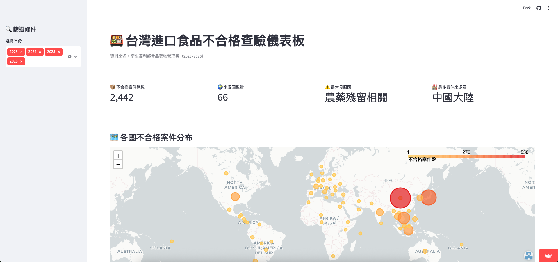
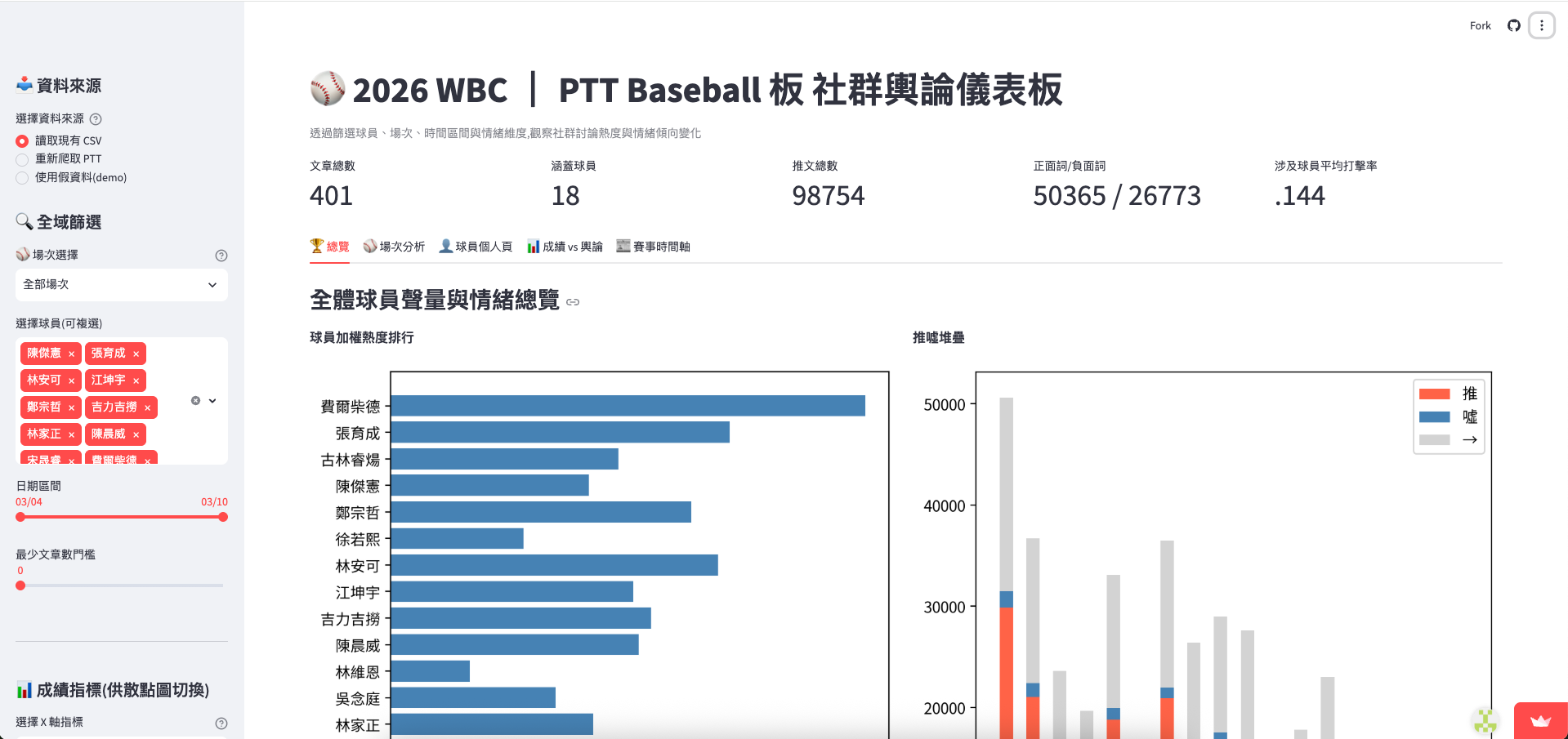
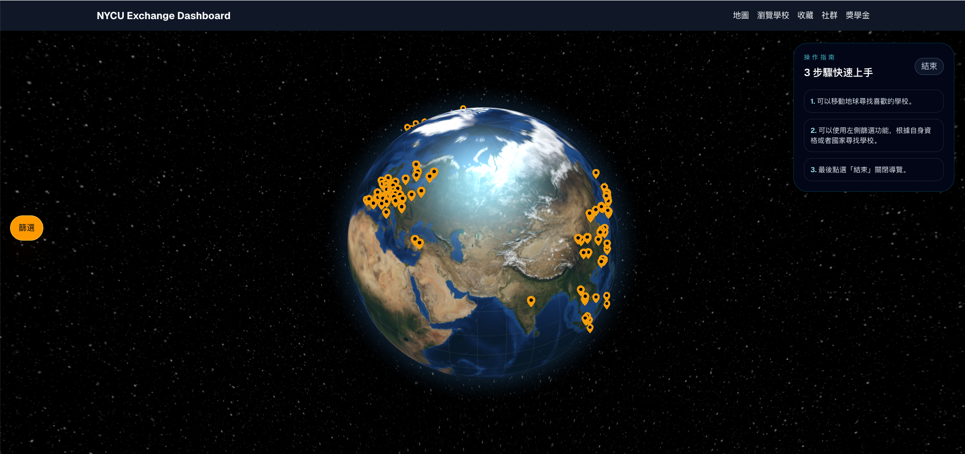
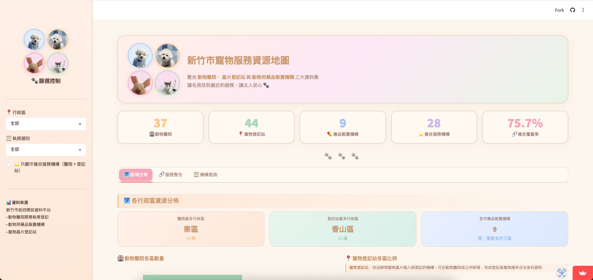
During the course, students developed interactive dashboards that transformed public, social, and cultural data into accessible visual interfaces.
台灣進口食品不合格查驗儀表板
2026 WBC | PTT Baseball 板 社群輿論儀表板
NYCU Exchange Dashboard
新竹市寵物服務資源地圖
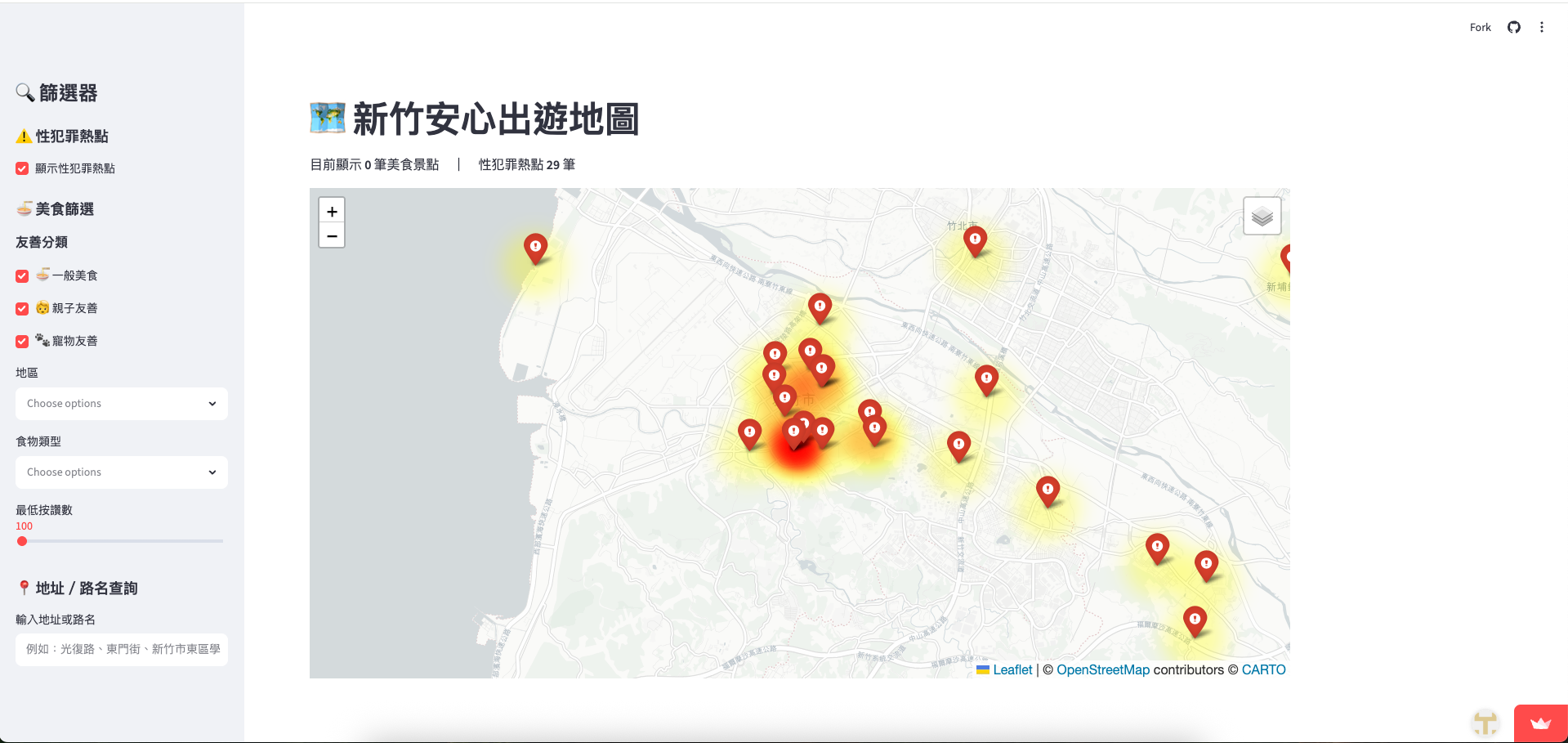
新竹安心出遊地圖
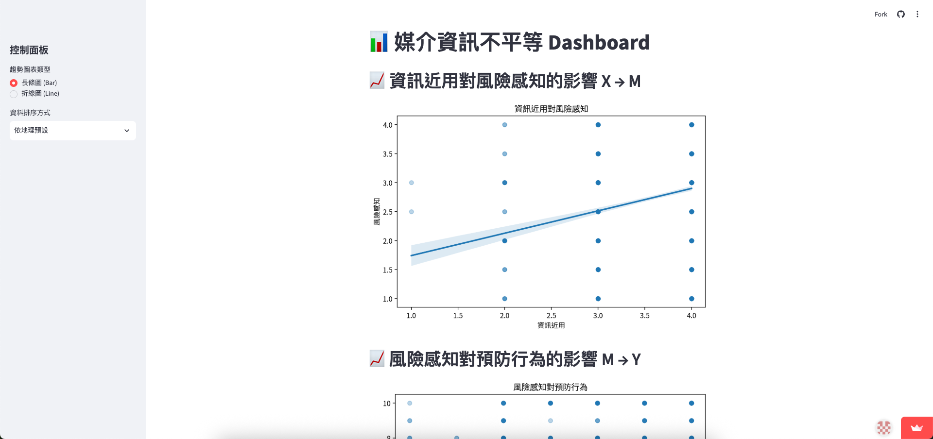
媒介資訊不平等 Dashboard
The course is taught by Justin Chun-ting Ho at National Yang Ming Chiao Tung University.